.png?fit=max&auto=format&n=z7mn2_Xnb9V482Ot&q=85&s=a7da8ae8f848315623c283d39843d7f2)
.png?fit=max&auto=format&n=z7mn2_Xnb9V482Ot&q=85&s=b93021eebe7a4c4147a406759ca21037)
Component categories
The component palette (opened via the + button in the bottom-right of the canvas) organizes every component into six top-level categories:Screen
Screen
Add a new screen to your app. Choose a blank Screen, or start from a pre-built Sign-in, Settings, or Player screen.
Layout
Layout
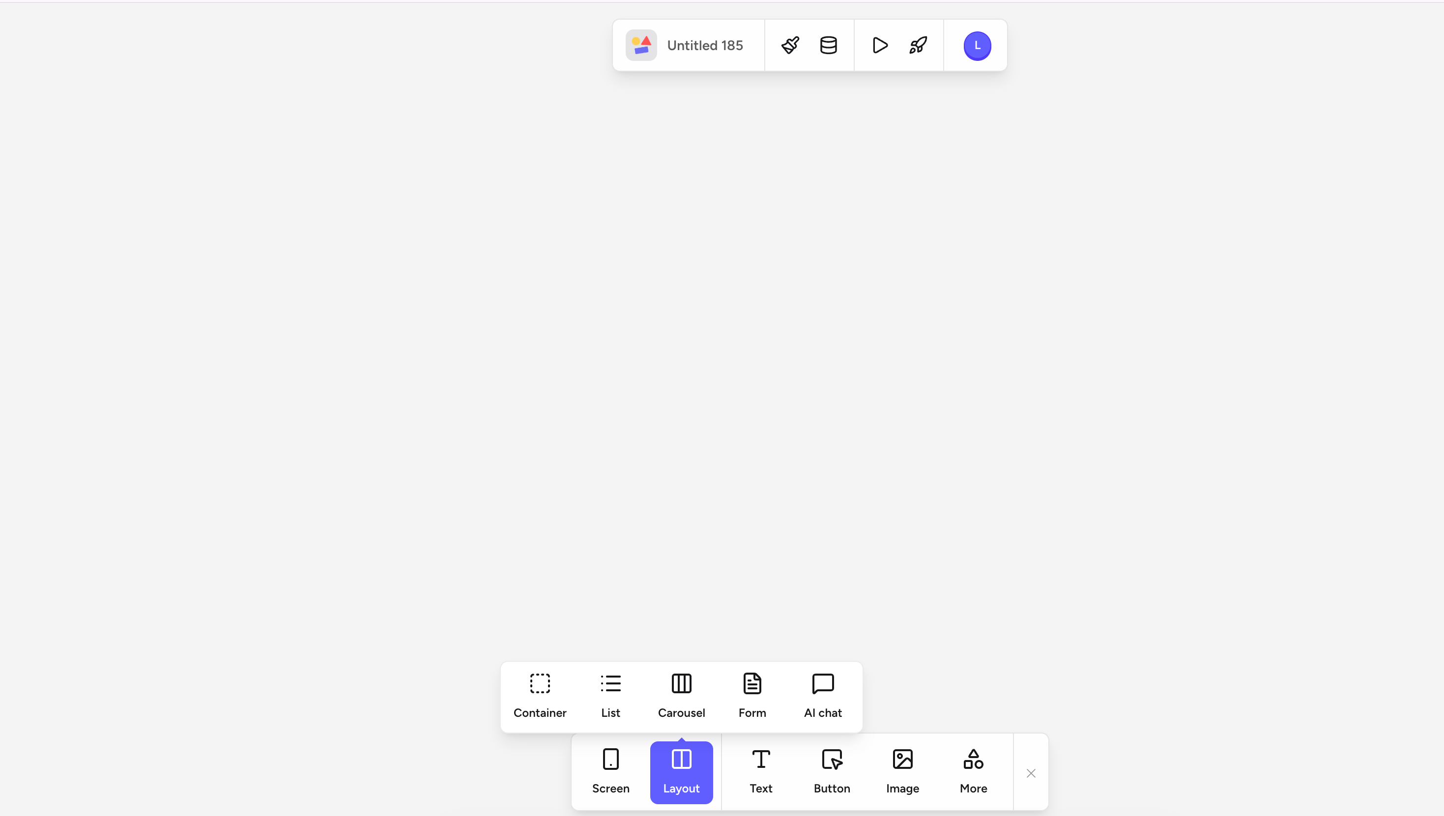
Structural components that hold other elements: Container, List, Carousel, Form, and AI chat. Lists, Carousels, and Forms can each be bound to a data table so they repeat their template per entry.
Text
Text
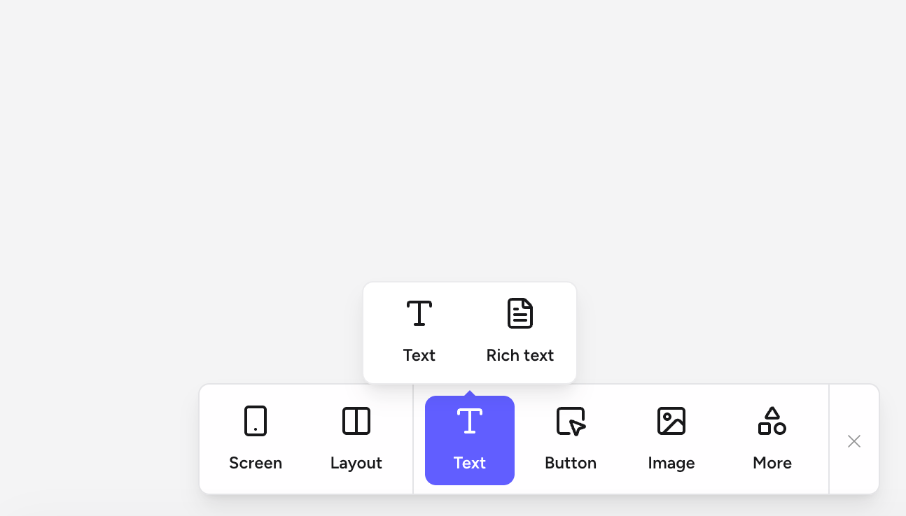
Display copy on the canvas. Pick a plain Text element for headings, paragraphs, and labels, or a Rich text block when you need in-app formatting controls (bold, links, lists, headings).
Image
Image
Add an Image from an upload, a URL, or a data field. Bind an image field on a table entry to render dynamic images inside a List item.
More
More
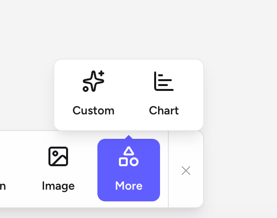
Advanced elements that don’t fit the other categories: Custom components (bring your own snippet) and Chart visualizations (bar, line, and pie backed by a data source).
Adding a component to the canvas
Every component is added from the component palette — a floating bar that lives at the bottom of the editor.1
Tap the + button
In an empty area of the canvas, tap the + button in the bottom-right corner to open the palette.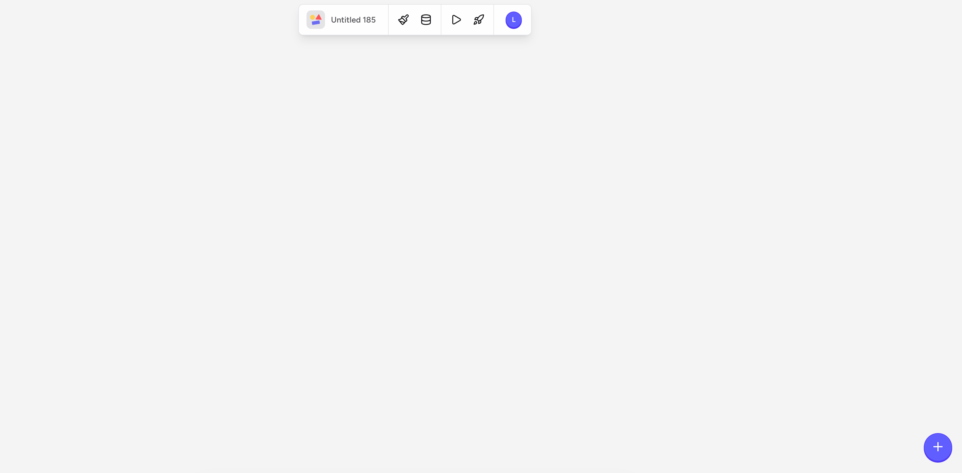
2
Pick a category
The palette shows the top-level categories: Screen, Layout, Text, Button, Image, and More. Tap any category to open its submenu of specific elements.
3
Choose an element from the submenu
Each category expands into a submenu with the elements available in that group. Tap the element you want to drop it onto the canvas.
- Screen
- Layout
- Text
- More
Add a new screen to your app: a blank Screen, a pre-built Sign-in screen, a Settings screen, or a Player screen.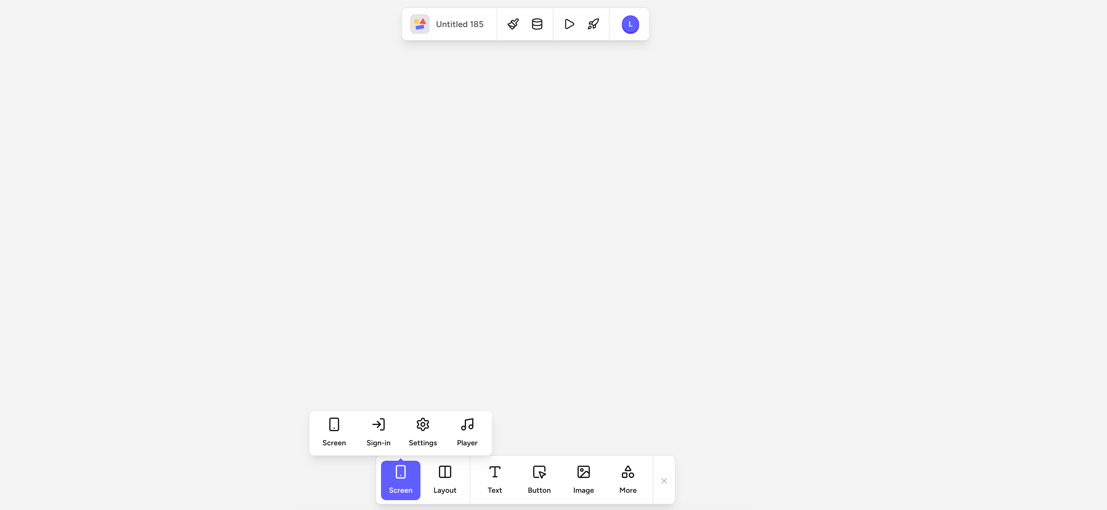
4
Position and resize
Once the element is on the canvas, drag it to reposition it or use the resize handles. Fine-tune size and alignment from the Layout tab of the property toolbar.
Configuring a component
Select any component on the canvas to open its property toolbar — a floating bar that appears directly above the selected component. The available settings vary by component type, but every component shares the same four tabs:Settings
Component-specific options — the destination of a Button, the placeholder text of a form field, and so on. A List’s source table is set separately via the Data option.
Layout
Size, padding, margin, and alignment, plus how the component sizes itself inside its parent (fixed size, fill container, or hug content).
Logic
Attach Logic to the component — triggers, actions, and optional rules that run in response to user events.
Styles
Colors, fonts, borders, corner radius, opacity, and shadow. Values pull from your app’s palette by default — see Design.
Binding a component to data
Static text and images are useful, but Rey becomes powerful when you connect components to live data. Binding links a component’s content to a field on a table entry.1
Connect the List to a data table
Click the List to select it, open the property toolbar above it, and choose Data. Select the table you want as the data source.
2
Select the element to bind
Tap the element inside the List you want to bind — for example, a Text label in the row template — and open its property toolbar.
3
Choose Data field
Choose the Data field option in the property toolbar.
4
Pick the data field
Select the field you want to display — for example,
Users > display_name. The element now renders real data from that field and updates automatically when entries change.Copying and reusing components
- Duplicate a component by selecting it and pressing ⌘ D. The duplicate appears directly on top of the original — drag it into position.
- To reuse a complex arrangement of components across screens, save it as a template — see Templates.