> ## Documentation Index
> Fetch the complete documentation index at: https://docs.reyapp.io/llms.txt
> Use this file to discover all available pages before exploring further.
# Design Panel
> Use Rey's Design panel to control your app's typography, colors, screen structure, and navigation — the single place to customize how your entire app looks and flows.
The **Design panel** is where you customize how your entire app looks and flows. It's the single place to set your app's typography, color palette, screen structure, and navigation — changes here apply across every screen at once.
## Opening the Design panel
Click the **paintbrush icon** in the top toolbar of the [Canvas](/building/canvas) to open the Design panel. It slides out from the left and stays open while you work.
The panel has three tabs:
Every screen and object in your app, in one tree.
Typography and color palette applied app-wide.
Start screen and bottom tab bar configuration.
## Objects tab
The **Objects** tab shows every screen and its objects as a nested tree. Use it to jump between screens, find a specific component, or reorder objects without hunting through the canvas.
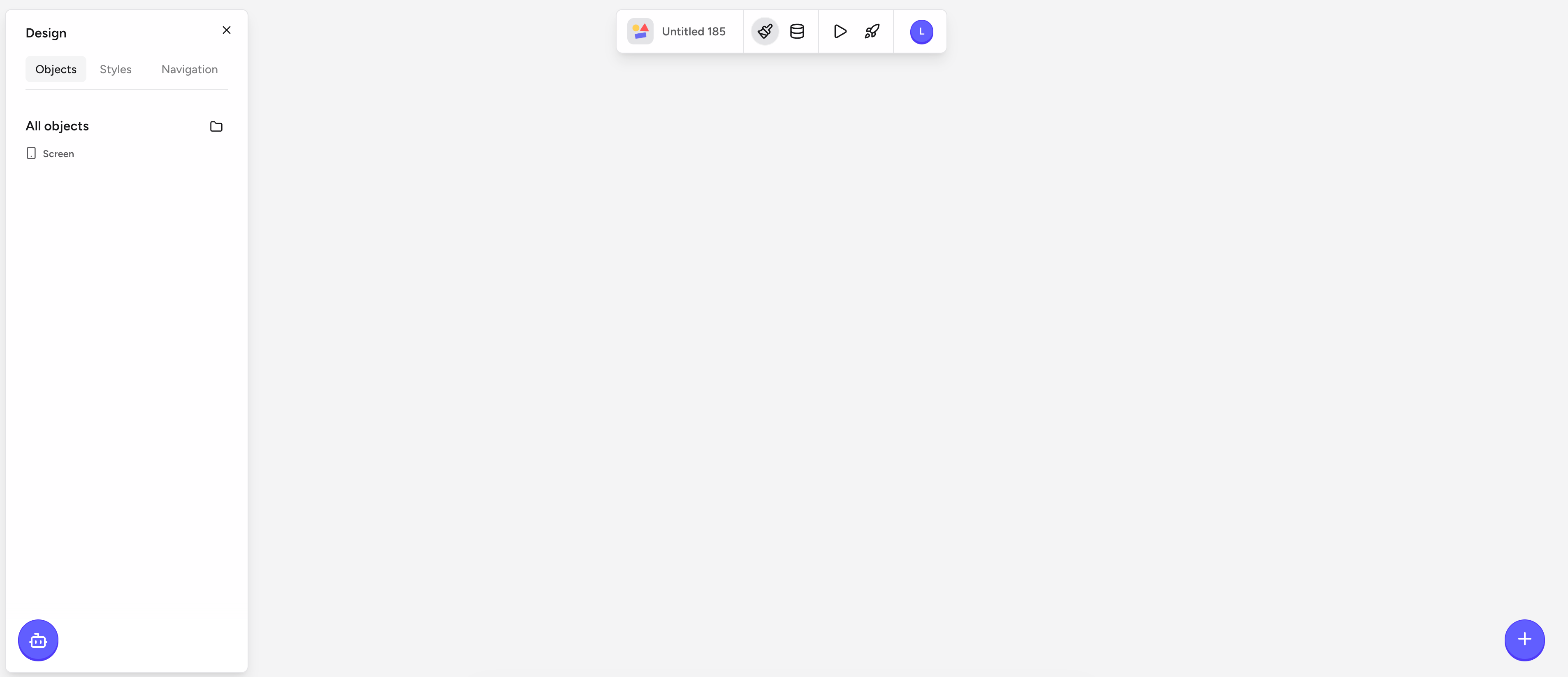 * Click any screen name to open it on the canvas.
* Expand a screen to see its components and groups.
* Selecting an item here selects it on the canvas so you can edit it with the property toolbar.
## Styles tab
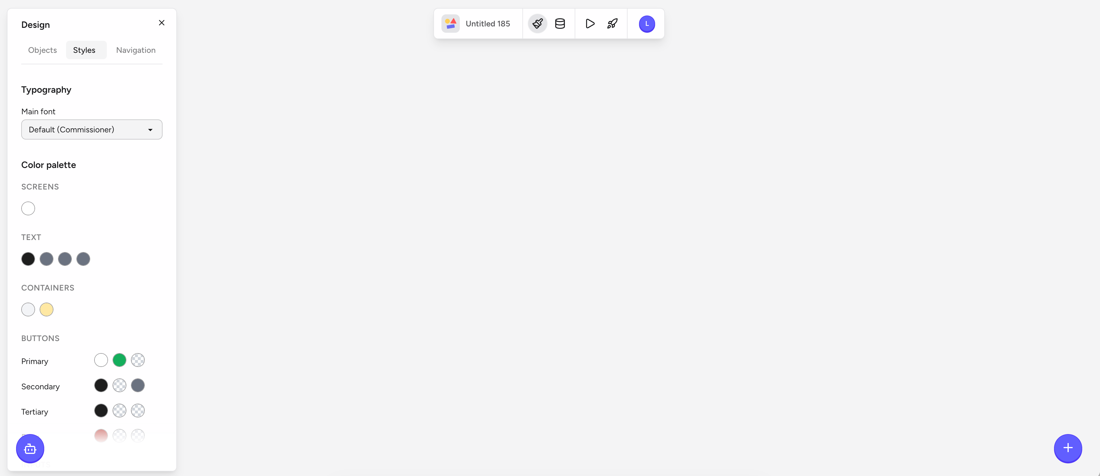
The **Styles** tab controls your app's visual identity. Anything you change here applies globally — every screen and every component updates instantly.
* Click any screen name to open it on the canvas.
* Expand a screen to see its components and groups.
* Selecting an item here selects it on the canvas so you can edit it with the property toolbar.
## Styles tab
The **Styles** tab controls your app's visual identity. Anything you change here applies globally — every screen and every component updates instantly.
 ### Typography
Pick a **Main font** for your app. Rey ships with a curated list of fonts (Commissioner is the default) that render well on iOS, Android, and the web. Every text component uses this font unless you override it on the individual component.
### Color palette
Define the reusable colors your app uses. The palette is grouped by role so your design stays consistent:
* **Screens** — background colors for your screens.
* **Text** — default text colors.
* **Containers** — surfaces like cards, sheets, and grouped rows.
* **Buttons** — three levels of button styling:
* **Primary** — your main call-to-action color.
* **Secondary** — supporting actions.
* **Tertiary** — low-emphasis actions and links.
When you set a color here, every component bound to that role updates across the whole app. This is the fastest way to rebrand or dark-mode-tune your app without touching individual screens.
## Navigation tab
The **Navigation** tab controls how users move through your app.
### Typography
Pick a **Main font** for your app. Rey ships with a curated list of fonts (Commissioner is the default) that render well on iOS, Android, and the web. Every text component uses this font unless you override it on the individual component.
### Color palette
Define the reusable colors your app uses. The palette is grouped by role so your design stays consistent:
* **Screens** — background colors for your screens.
* **Text** — default text colors.
* **Containers** — surfaces like cards, sheets, and grouped rows.
* **Buttons** — three levels of button styling:
* **Primary** — your main call-to-action color.
* **Secondary** — supporting actions.
* **Tertiary** — low-emphasis actions and links.
When you set a color here, every component bound to that role updates across the whole app. This is the fastest way to rebrand or dark-mode-tune your app without touching individual screens.
## Navigation tab
The **Navigation** tab controls how users move through your app.
 ### Start screen
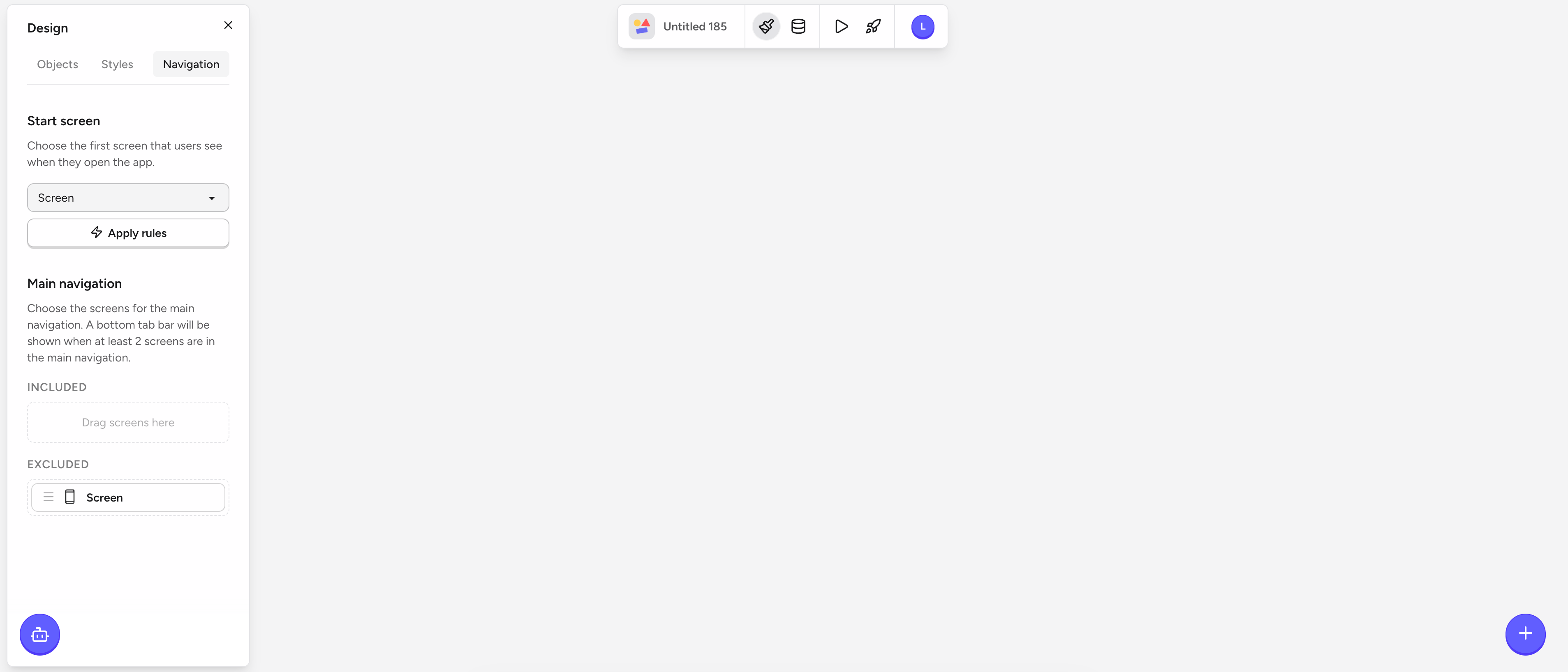
Pick which screen users see first when they open your app. You can also **Apply rules** to conditionally route users — for example, send signed-in users to a home screen and everyone else to a login screen.
### Main navigation
Configure your app's bottom tab bar by moving screens between **Included** and **Excluded**:
* **Included** — screens that appear as tabs in the bottom tab bar.
* **Excluded** — screens users reach through actions, links, or flows, but not from the tab bar.
The bottom tab bar automatically appears when you include **two or more** screens. With one included screen, the tab bar is hidden.
## Related
The visual editor where the Design panel lives.
Individual UI elements that pick up your palette and typography.
### Start screen
Pick which screen users see first when they open your app. You can also **Apply rules** to conditionally route users — for example, send signed-in users to a home screen and everyone else to a login screen.
### Main navigation
Configure your app's bottom tab bar by moving screens between **Included** and **Excluded**:
* **Included** — screens that appear as tabs in the bottom tab bar.
* **Excluded** — screens users reach through actions, links, or flows, but not from the tab bar.
The bottom tab bar automatically appears when you include **two or more** screens. With one included screen, the tab bar is hidden.
## Related
The visual editor where the Design panel lives.
Individual UI elements that pick up your palette and typography.