> ## Documentation Index
> Fetch the complete documentation index at: https://docs.reyapp.io/llms.txt
> Use this file to discover all available pages before exploring further.
# Components
> Explore Rey's library of pre-built UI components — buttons, text fields, lists, and nav bars — and learn how to configure and bind them to data.
Components are the pre-built UI elements that make up every screen in your app. Instead of writing code to render a button or a data list, you pick the component you need from the palette, drop it onto the canvas, and configure it in its property toolbar. Every visual element in Rey — from a simple text label to a scrollable collection of cards — is a component.
## Component categories
The component palette (opened via the **+ button** in the bottom-right of the canvas) organizes every component into six top-level categories:
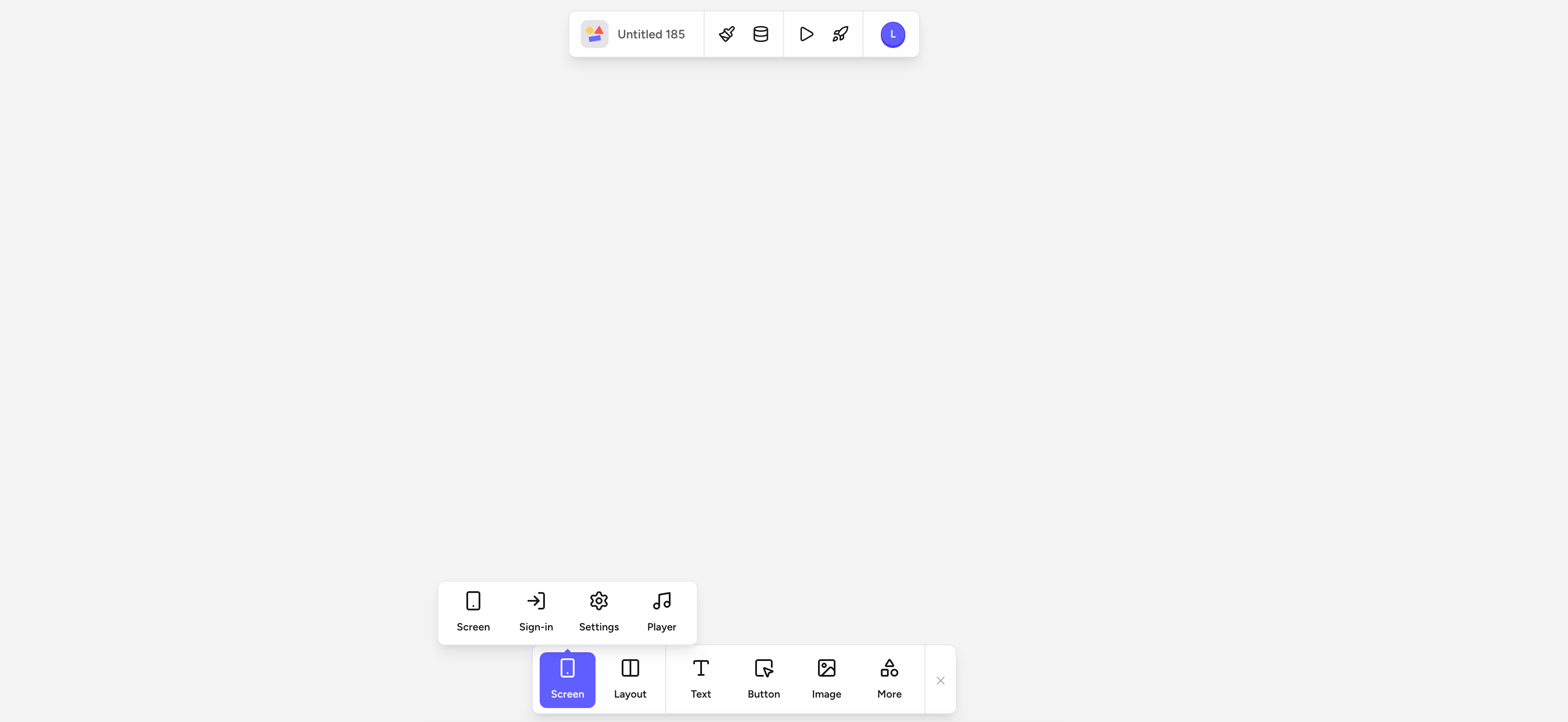
Add a new screen to your app. Choose a blank **Screen**, or start from a pre-built **Sign-in**, **Settings**, or **Player** screen.
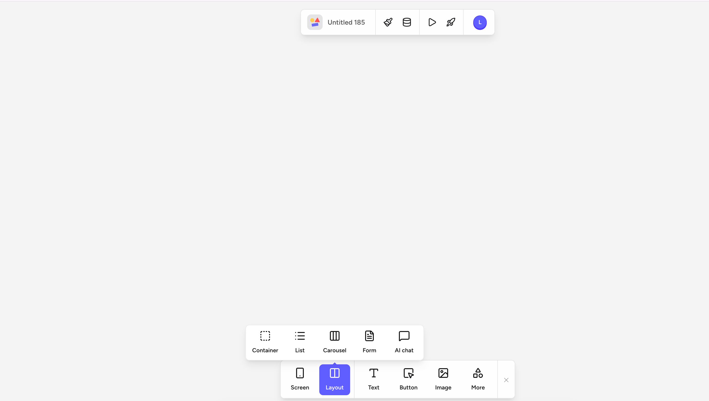
Structural components that hold other elements: **Container**, **List**, **Carousel**, **Form**, and **AI chat**. Lists, Carousels, and Forms can each be bound to a data table so they repeat their template per entry.
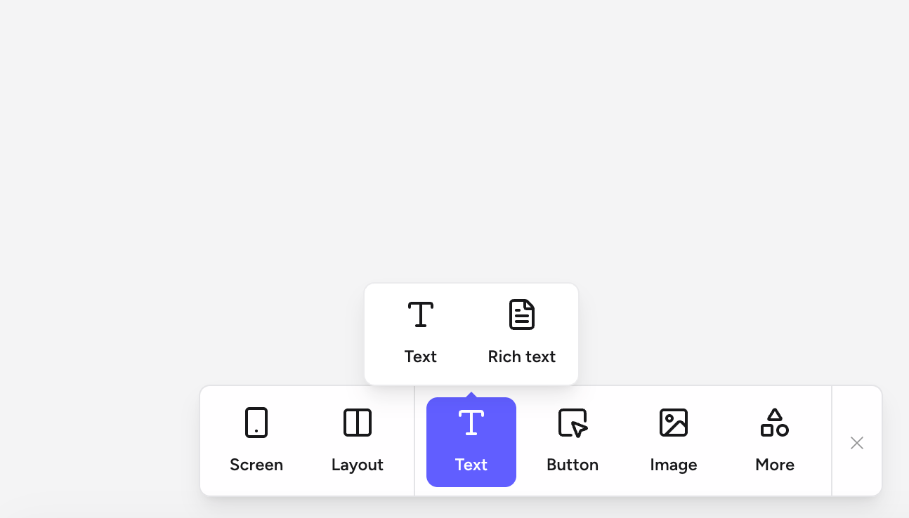
Display copy on the canvas. Pick a plain **Text** element for headings, paragraphs, and labels, or a **Rich text** block when you need in-app formatting controls (bold, links, lists, headings).
The primary trigger for logic. Add a **Button** and attach actions to it via the **Logic** tab in the property toolbar. Buttons pick up the Primary / Secondary / Tertiary colors defined in the [Design](/building/design) panel.
Add an **Image** from an upload, a URL, or a data field. Bind an image field on a table entry to render dynamic images inside a List item.
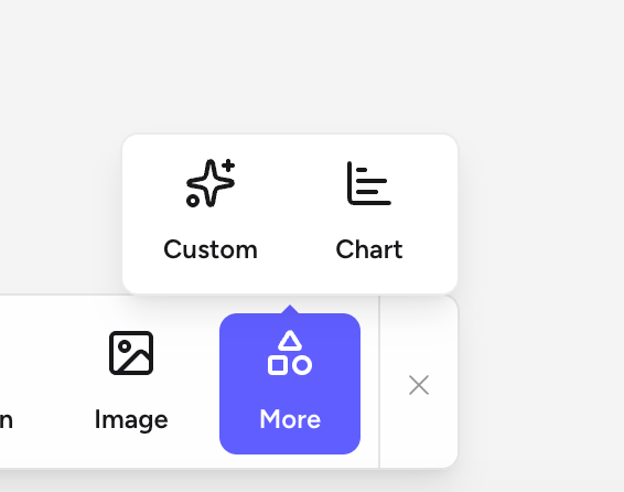
Advanced elements that don't fit the other categories: **Custom** components (bring your own snippet) and **Chart** visualizations (bar, line, and pie backed by a data source).
## Adding a component to the canvas
Every component is added from the **component palette** — a floating bar that lives at the bottom of the editor.
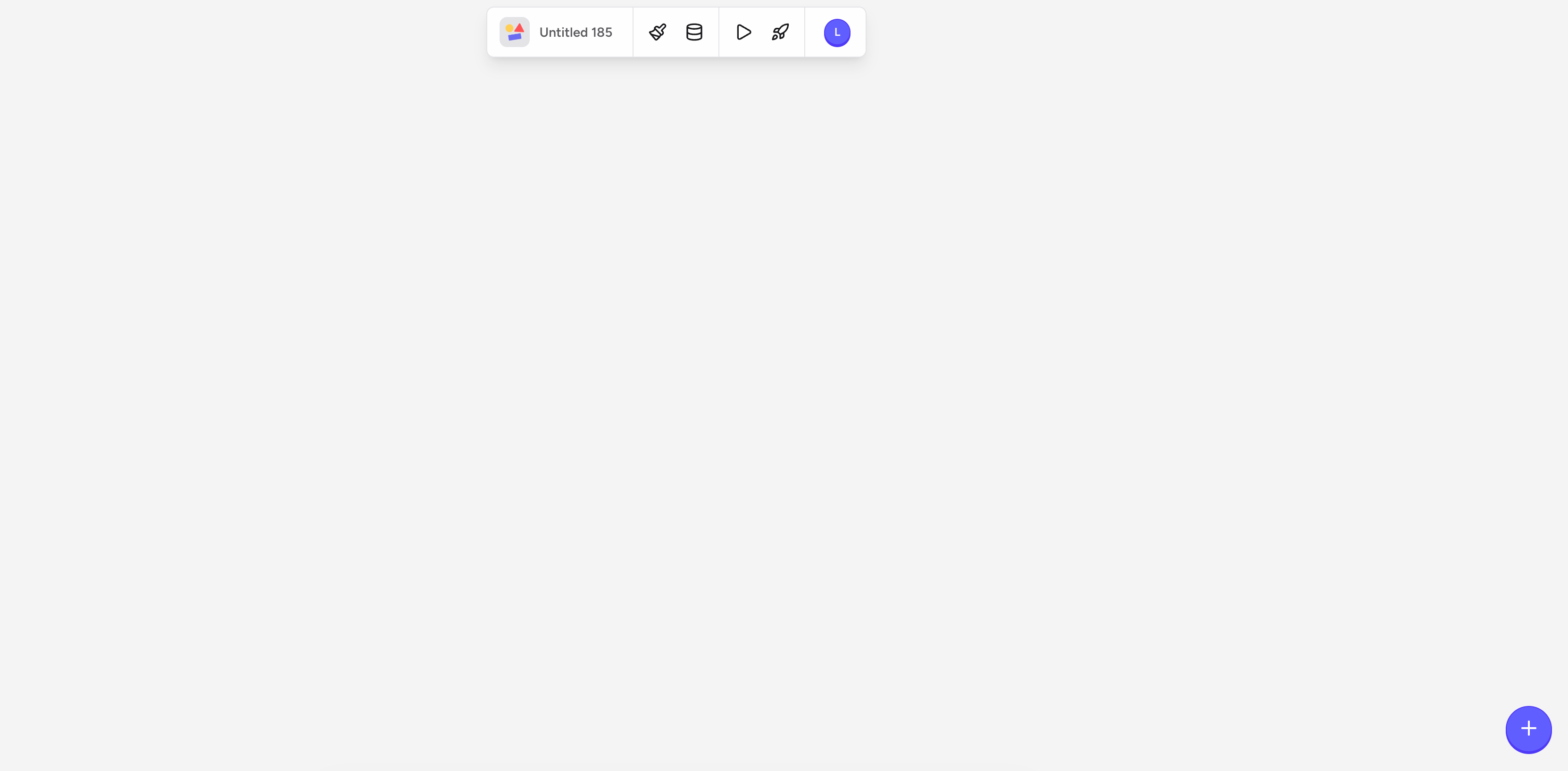
In an empty area of the canvas, tap the **+** button in the bottom-right corner to open the palette.
 The palette shows the top-level categories: **Screen**, **Layout**, **Text**, **Button**, **Image**, and **More**. Tap any category to open its submenu of specific elements.
Each category expands into a submenu with the elements available in that group. Tap the element you want to drop it onto the canvas.
Add a new screen to your app: a blank **Screen**, a pre-built **Sign-in** screen, a **Settings** screen, or a **Player** screen.
The palette shows the top-level categories: **Screen**, **Layout**, **Text**, **Button**, **Image**, and **More**. Tap any category to open its submenu of specific elements.
Each category expands into a submenu with the elements available in that group. Tap the element you want to drop it onto the canvas.
Add a new screen to your app: a blank **Screen**, a pre-built **Sign-in** screen, a **Settings** screen, or a **Player** screen.
 Structural components that hold other elements: **Container**, **List**, **Carousel**, **Form**, and **AI chat**.
 Choose between a simple **Text** element or a **Rich text** block with formatting controls.
 Advanced elements that don't fit the other categories: **Custom** components and **Chart** visualizations.
 Once the element is on the canvas, drag it to reposition it or use the resize handles. Fine-tune size and alignment from the **Layout** tab of the property toolbar.
## Configuring a component
Select any component on the canvas to open its **property toolbar** — a floating bar that appears directly above the selected component. The available settings vary by component type, but every component shares the same four tabs:
Component-specific options — the destination of a Button, the placeholder text of a form field, and so on. A List's source table is set separately via the **Data** option.
Size, padding, margin, and alignment, plus how the component sizes itself inside its parent (fixed size, fill container, or hug content).
Attach [Logic](/building/interactions) to the component — triggers, actions, and optional rules that run in response to user events.
Colors, fonts, borders, corner radius, opacity, and shadow. Values pull from your app's palette by default — see [Design](/building/design).
## Binding a component to data
Static text and images are useful, but Rey becomes powerful when you connect components to live data. Binding links a component's content to a **field** on a table entry.
Click the List to select it, open the property toolbar above it, and choose **Data**. Select the table you want as the data source.
Tap the element inside the List you want to bind — for example, a **Text** label in the row template — and open its property toolbar.
Choose the **Data field** option in the property toolbar.
Select the field you want to display — for example, `Users > display_name`. The element now renders real data from that field and updates automatically when entries change.
Use the **Logic** tab to gate a component's visibility with a rule — for example, only show an "Admin" badge when the current user's `role` field equals `admin`.
## Copying and reusing components
* **Duplicate** a component by selecting it and pressing **⌘ D**. The duplicate appears directly on top of the original — drag it into position.
* To reuse a complex arrangement of components across screens, save it as a template — see [Templates](/building/templates).
Once the element is on the canvas, drag it to reposition it or use the resize handles. Fine-tune size and alignment from the **Layout** tab of the property toolbar.
## Configuring a component
Select any component on the canvas to open its **property toolbar** — a floating bar that appears directly above the selected component. The available settings vary by component type, but every component shares the same four tabs:
Component-specific options — the destination of a Button, the placeholder text of a form field, and so on. A List's source table is set separately via the **Data** option.
Size, padding, margin, and alignment, plus how the component sizes itself inside its parent (fixed size, fill container, or hug content).
Attach [Logic](/building/interactions) to the component — triggers, actions, and optional rules that run in response to user events.
Colors, fonts, borders, corner radius, opacity, and shadow. Values pull from your app's palette by default — see [Design](/building/design).
## Binding a component to data
Static text and images are useful, but Rey becomes powerful when you connect components to live data. Binding links a component's content to a **field** on a table entry.
Click the List to select it, open the property toolbar above it, and choose **Data**. Select the table you want as the data source.
Tap the element inside the List you want to bind — for example, a **Text** label in the row template — and open its property toolbar.
Choose the **Data field** option in the property toolbar.
Select the field you want to display — for example, `Users > display_name`. The element now renders real data from that field and updates automatically when entries change.
Use the **Logic** tab to gate a component's visibility with a rule — for example, only show an "Admin" badge when the current user's `role` field equals `admin`.
## Copying and reusing components
* **Duplicate** a component by selecting it and pressing **⌘ D**. The duplicate appears directly on top of the original — drag it into position.
* To reuse a complex arrangement of components across screens, save it as a template — see [Templates](/building/templates).